


Company:
Alibaba Travels Co. has been active in Iran’s travel and tourist business since January 2014 as a startup. Alibaba Travels Co. is the pioneer of online travel services in Iran. Alibaba offices are located in Tehran and they are providing innovative, competitive, and enjoyable services for the people who visit Iran and all Iranians traveling around the world.
Alibaba’s headquarter in Tehran, Iran
My role:
As a product designer, I was responsible for redesigning the app and fixing UI/UX Issues in the previous version of the app. I also had to solve the problem of low app return & engagement.
Problems:
- Low user retention and engagement on the previous version of the Alibaba app
- Challenges in scaling the app and incorporating new features
- High churn rate – users try the app once but never return

Solutions:
- Redesign Homepage for scalability
- Integrate marketing touchpoints and personalized recommendations
- Optimize user flows and Information Architecture.
Design process:
To redesign the app effectively, we gathered insights from user interviews, support teams, analytics data, and user reviews. Additionally, with the help of the product manager, we obtained business requirements from stakeholders. This allowed us to prioritize and address issues during the ideation phase efficiently.

Photo from Interaction Design Foundation
Research phase:
With support from Alibaba’s UX research team, we conducted deep interviews to gain valuable insights and identify key issues. Additionally, we utilized the Card sorting technique to understand how users perceive and prioritize information, significantly aiding in the redesign of the My Trips section. Moreover, I personally conducted a competitive analysis, evaluating each competitor’s pros and cons to inform our design decisions.
The app’s most common personas are:
- Business Professionals (Aged 30-40) – Prioritize efficient bookings for productivity during trips.
- Explorers and Adventurers (Aged 25-35) – Seek unique experiences and budget-friendly options.
- Family Vacationers – Value family-friendly destinations and stress-free planning.
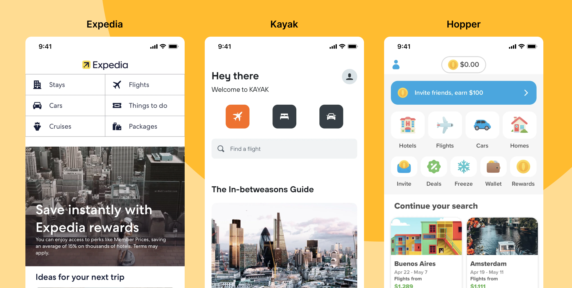
Competitor Analysis
During the competitor analysis, we thoroughly examined major players like the Expedia app, Skyscanner, and Trip.com. Additionally, we took into account relevant insights from local businesses in the industry. This comprehensive approach allowed us to gain valuable insights into the market landscape and identify potential areas for improvement in our own app.
Brainstorming & Wireframing:
After conducting competitor analysis, we initiated the design concept phase and conducted brainstorming sessions to explore multiple ideas. We leveraged insights from competitor research and incorporated findings from card sorting, as well as data gathered from support, research, and other sources, to enhance our designs and decision-making.

User testing session:
After brainstorming, we had two different designs. To evaluate them effectively, we decided to create prototypes and conducted usability tests with Alibaba’s real customers. To ensure a comprehensive assessment, we included various user segments, such as loyal customers and churn customers, each represented by different personas.
Solutions
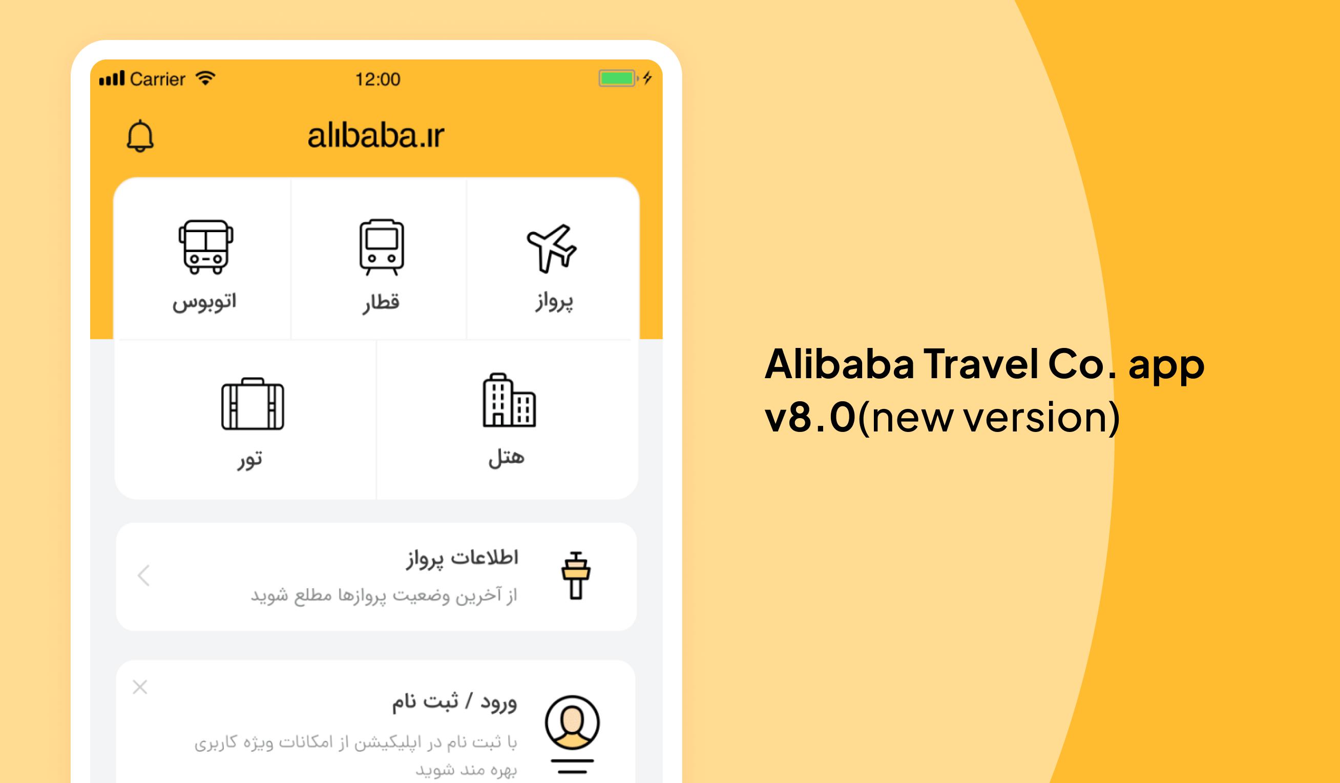
Redesign Homepage for scalability
In the latest version, the process of adding a new product or feature has been made simple and seamless. Additionally, an icon has been included for improved visibility, enabling users to quickly locate and access new products or features.
Integrate marketing touchpoints and personalized recommendations
In addition to redesigning the product vertical section, we implemented marketing touchpoints and personalized offers to further enhance user attraction and engagement.

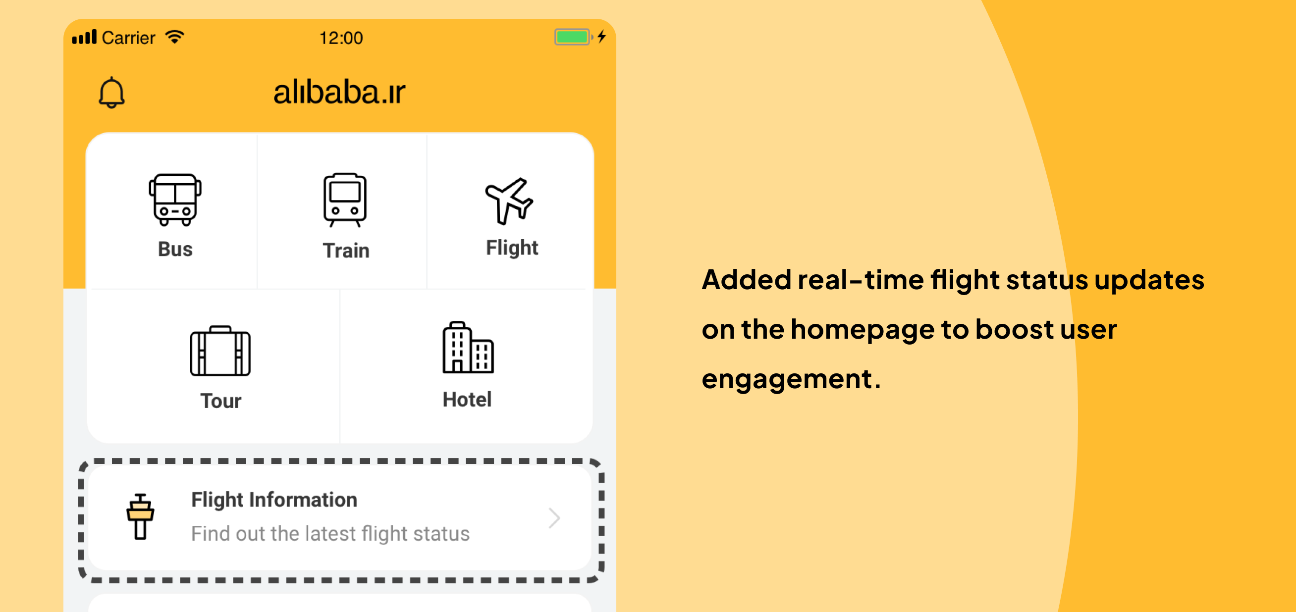
Another approach we took to boost user engagement was by adding some free but useful features, like real-time flight status updates on the homepage.
Optimize user flows and Information Architecture
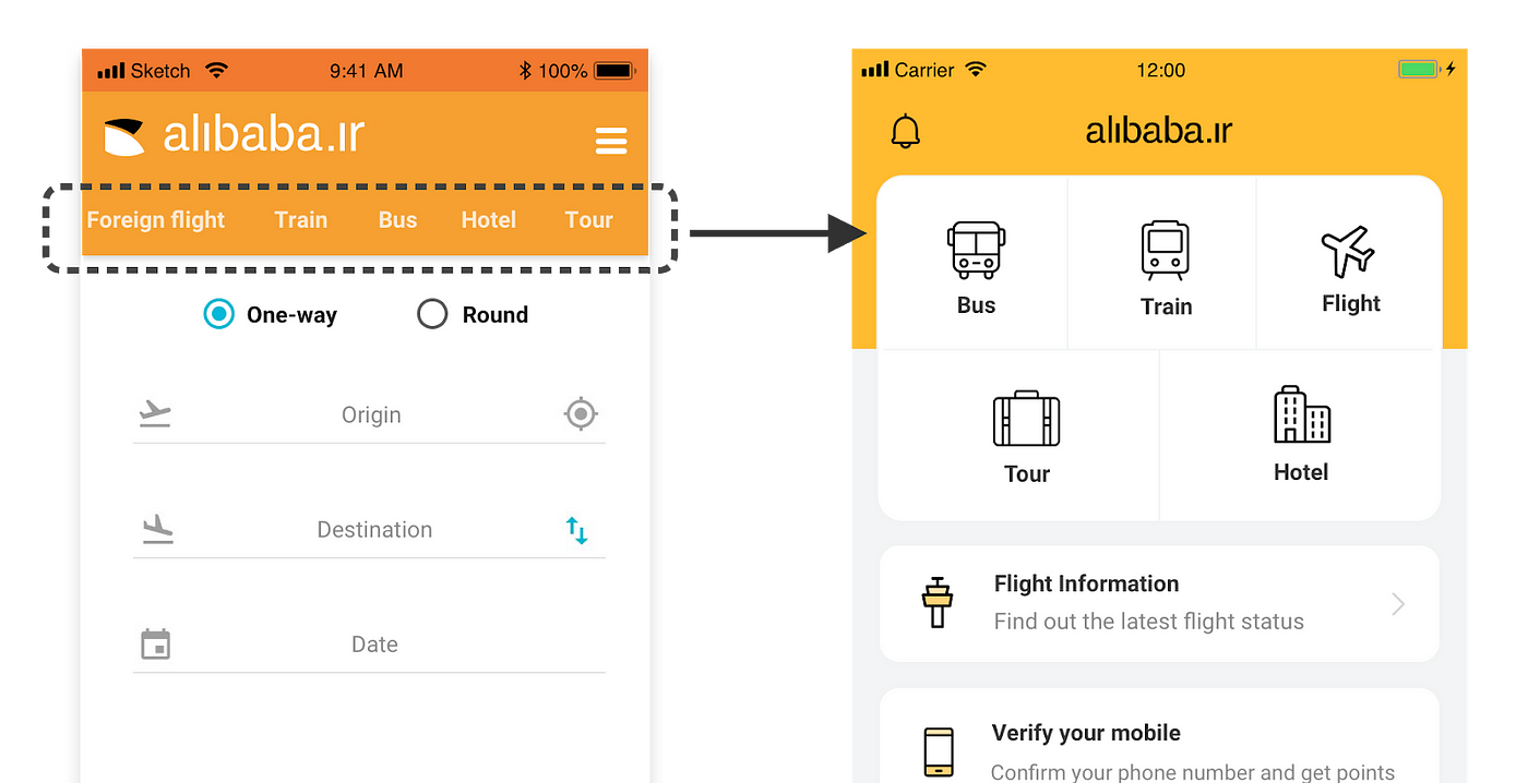
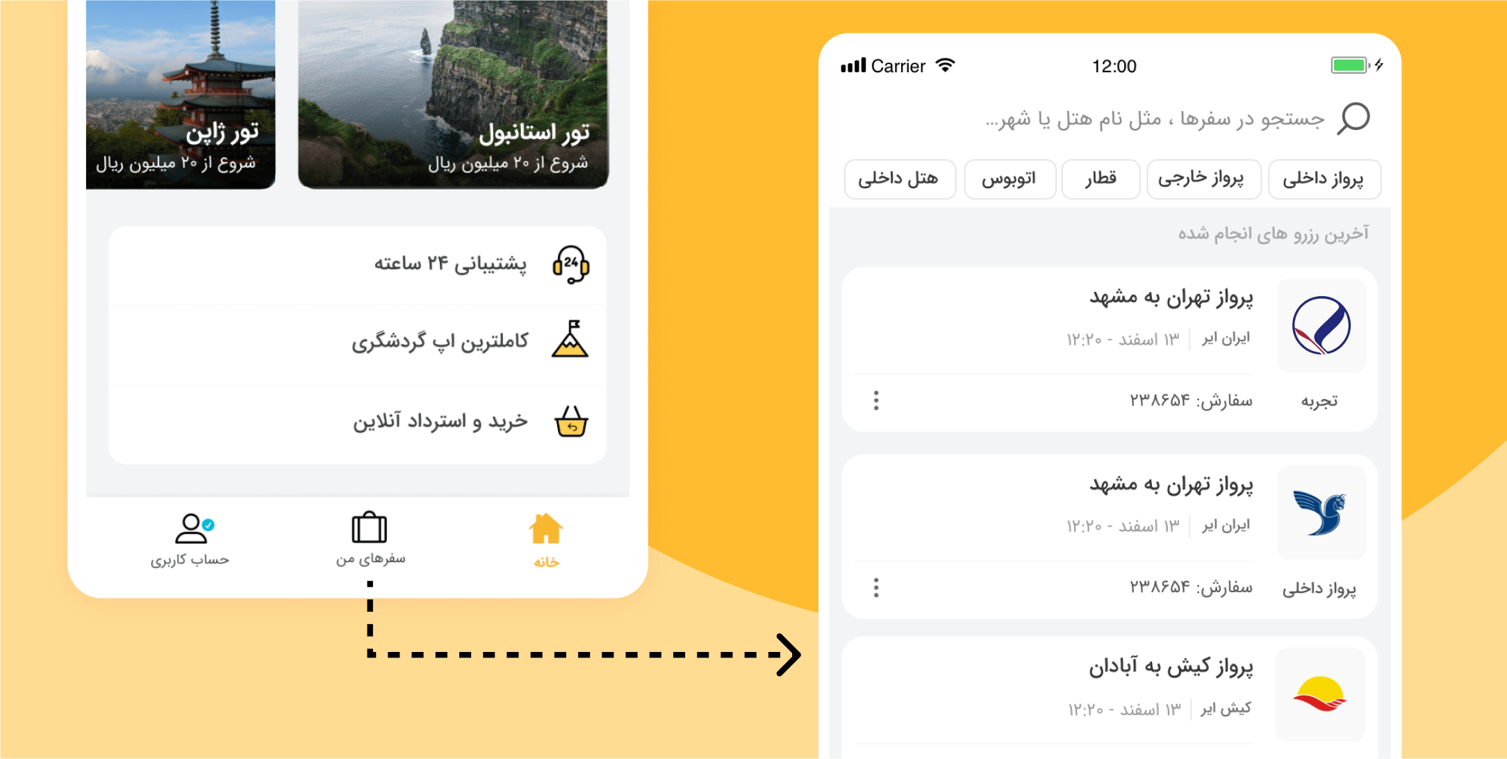
We Removed the hamburger menu due to its unfriendly user experience; it was far from the thumb zone and lacked clear item labels. It was replaced with a bottom navigation bar, including “My Trips” to enhance accessibility.

Implemented navigation menu changes resulted in a two-step reduction in “My Trips” process. Frequently used tools were strategically placed within the user’s thumb zone.

Moreover, a new “Recent Tickets” section simplified ticket selection for improved user experience.
conclusion
In conclusion, our data-driven design decisions, usability testing, and strategic implementation of marketing touchpoints resulted in a significant enhancement of user engagement and a streamlined user experience.
The redesign garnered overwhelmingly positive feedback in Google Play reviews and social media. Additionally, our analytics data demonstrated a notable increase in user engagement and a higher rate of app retention among users.
-
- Homepage
-
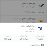
- My trip
-
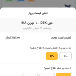
- Price alert
-
- My order summary
