Company Overview:
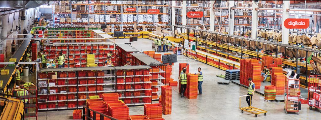
Digikala Group is a leading e-commerce organization with a strong presence in multiple online industries, including consumer goods, fashion and apparel, e-books, content publishing, digital advertising, big data, fintech, FMCG, and logistics. The company operates through its subsidiaries, including Digikala, DIGISTYLE, Fidibo, and Digipay, which together represent a significant portion of Iran’s online retail market share.
Learn more about Digikala in Forbes
My role:
As a UI/UX designer specializing in desktop user experience, I work closely with UX researchers and Mobile web UI/UX designers, Product managers, and stakeholders to create seamless user experiences.
We also have a CRO (Conversion Rate Optimization) team that collaborates with the UX team to test new design changes on the existing platform, aiming to increase the conversion rate.
The problems:
According to a UX research interview report, Digikala.com will have several challenges during its transition from a single-seller platform to a bustling marketplace. These challenges included:
- ❓Discovery: One of the primary concerns voiced by participants was regarding finding the right product among multiple sellers while also desiring an intuitive browsing and discovery experience.
- ❓Trust and Safety: According to the report, as the number of sellers involved in the marketplace continues to grow, one of the challenges would be maintaining a safe environment and ensuring customer satisfaction.
- ❓Multi-Seller Shipping: Managing shipping logistics for purchases from multiple sellers posed a significant challenge, requiring efficient coordination and tracking of shipments from different sources.
The solutions:
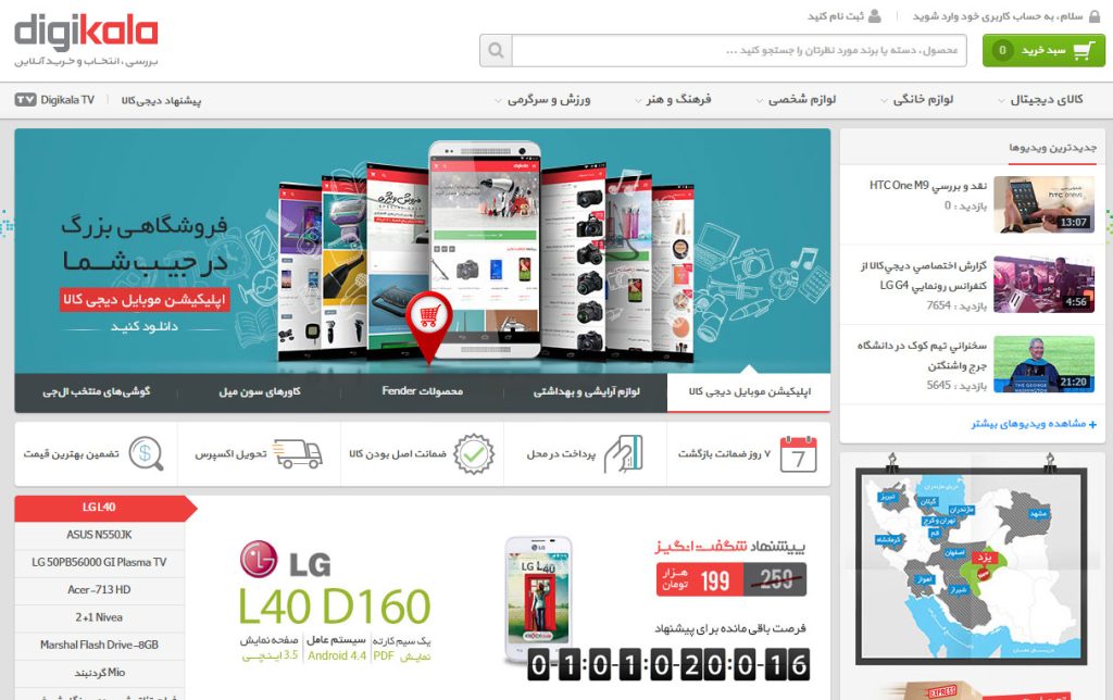
- 💡Discovery: revamped the homepage, transitioning from a fixed 1170px structure to a responsive layout optimized for several widths.Improving search, product categories, and main categories landing pages.
- 💡Trust and Safety: Provide comprehensive information about seller performance and customer satisfaction, to ensure that users have access to transparent and reliable data.
- 💡Multi-Seller Shipping: We are redesigning the shipping and checkout funnel to address the multi-seller issues.
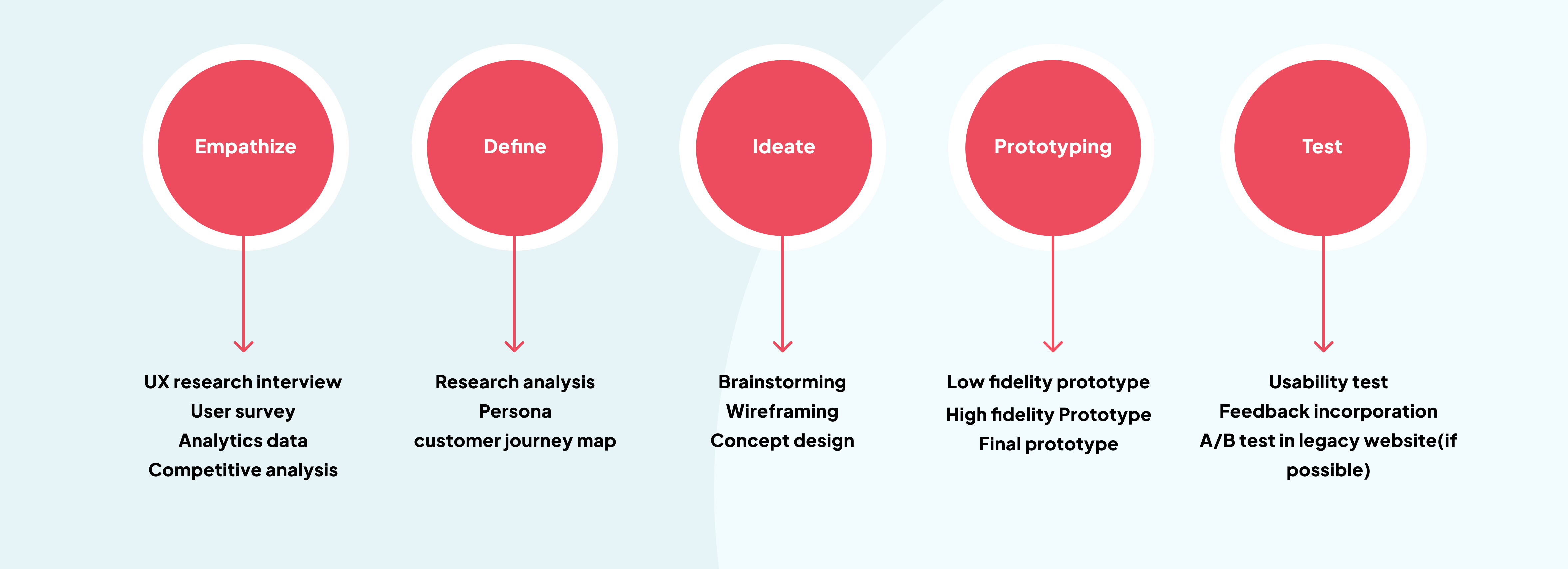
Design process: Research, Analysis, Brainstorming, and Design Concepts
Our design process adheres to a User-Centered Design Approach, prioritizing user needs while collaborating with stakeholders to align with business goals.
While our research team conducts user interviews to gather valuable feedback, I personally undertake a comprehensive competitive analysis with our competitors. We also gather a lot of user pain points throughout the support team, survey, and analytics data.
User persona
Digikala accommodates a variety of personas, including tech enthusiasts, fashion lovers, home decorators, busy professionals, and budget-conscious shoppers.
Competitor Analysis
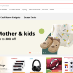
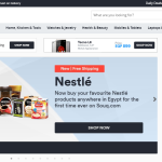
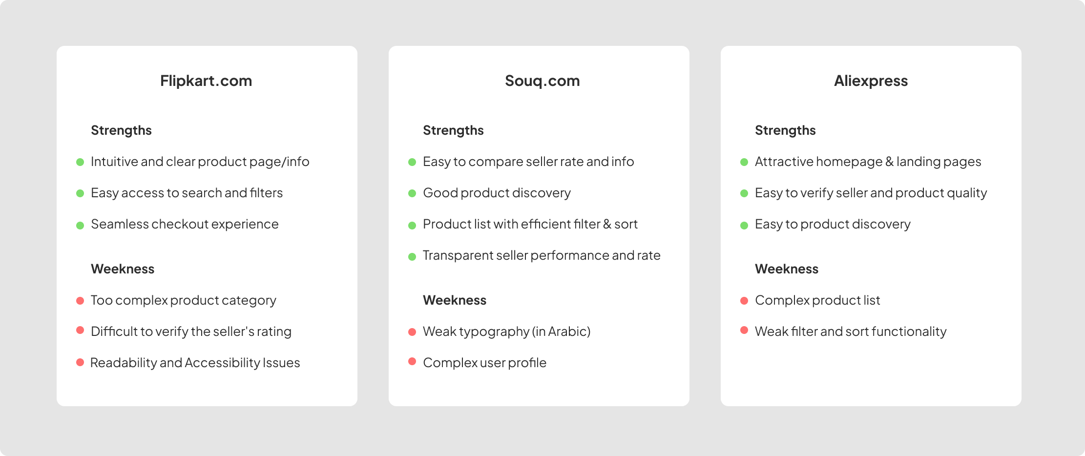
I have compiled a comprehensive list of major marketplace designs in the Middle East, along with a detailed checklist of their pros and cons. This list is intended to be shared with stakeholders, researchers, and other designers for their reference and consideration.
- Flipkart
- Aliexpress
- Souq.com
We have gathered a wealth of data from various sources, including user interviews, analytics data, insights from our support team, and thorough competitor analysis. This comprehensive dataset provides us with valuable information to inform our decision-making and drive strategic initiatives.
During the brainstorming phase, we collaborate with multiple stakeholders and product managers, each responsible for different sections of Digikala, such as ads service, discovery, and delivery. This collaboration presents a significant challenge due to the large number of stakeholders involved.
Brainstorming and wireframing
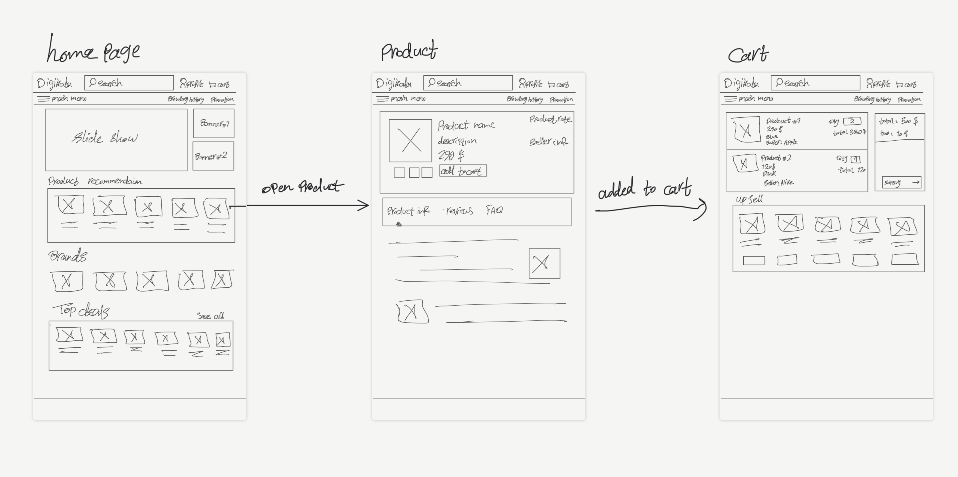
To begin brainstorming, we created wireframes as visual representations of our ideas. This allowed us to explore different design options and establish a starting point for further refinement, ensuring that our design aligns with project goals and user requirements.
Discovery:
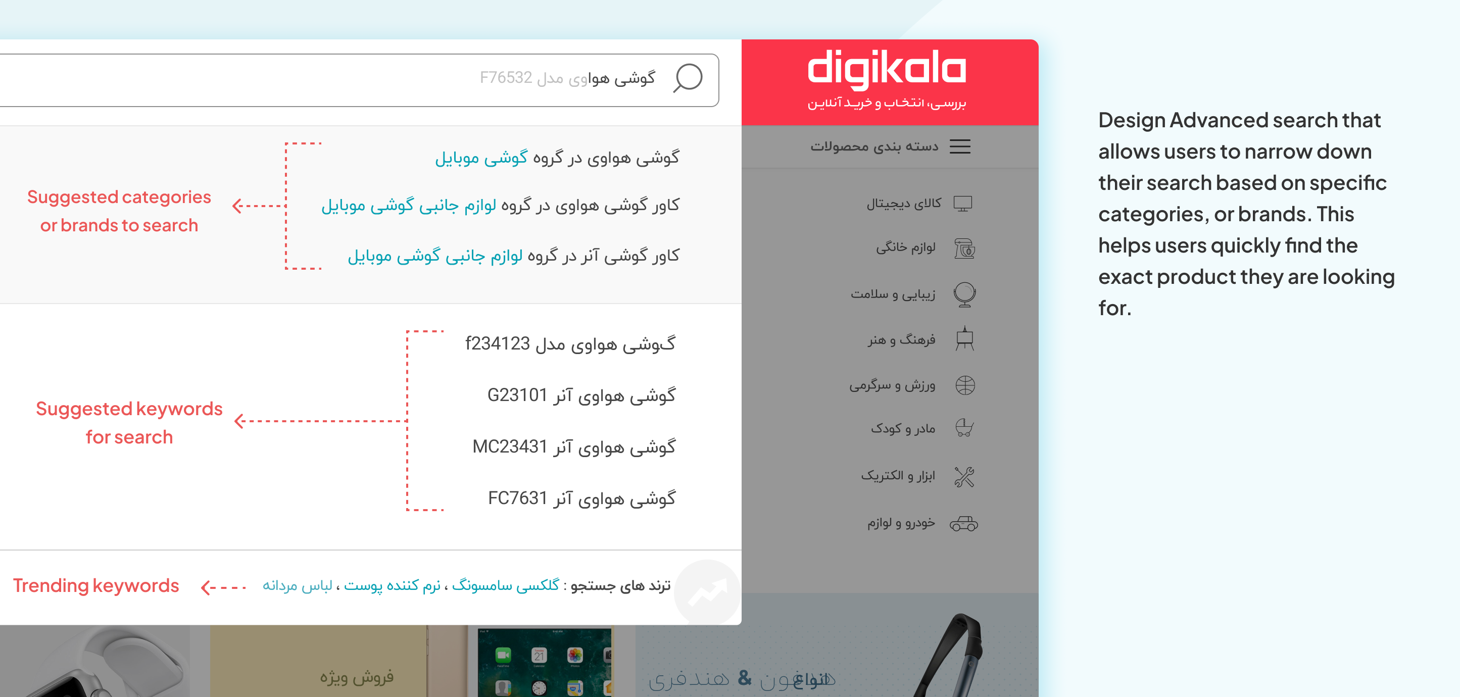
Finding a specific product among millions of products and hundred sellers can be challenging. To address this issue, we have proposed several solutions aimed at enhancing the search and discovery process. These include:
Advanced Search: Implementing robust search that allows users to search based on specific criteria such as category or brand.
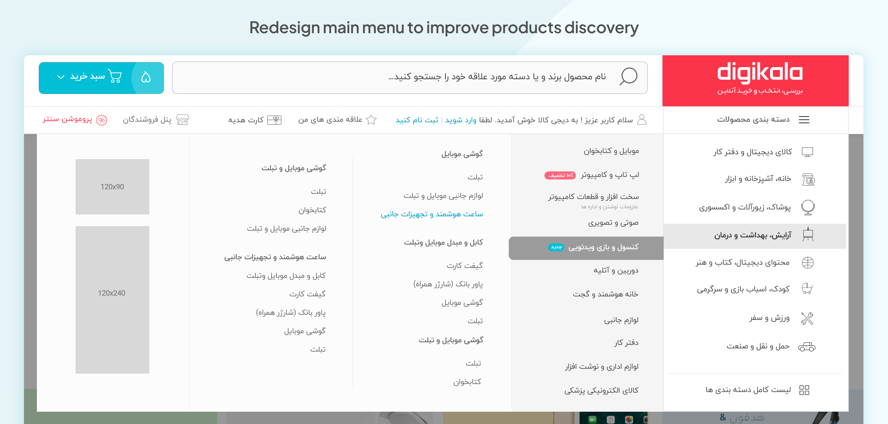
Enhanced Product Categorization: We redesigned the main menu, transitioning from horizontal to vertical for improved scalability. Additionally, we proposed new features to highlight and promote specific categories and also show ads.
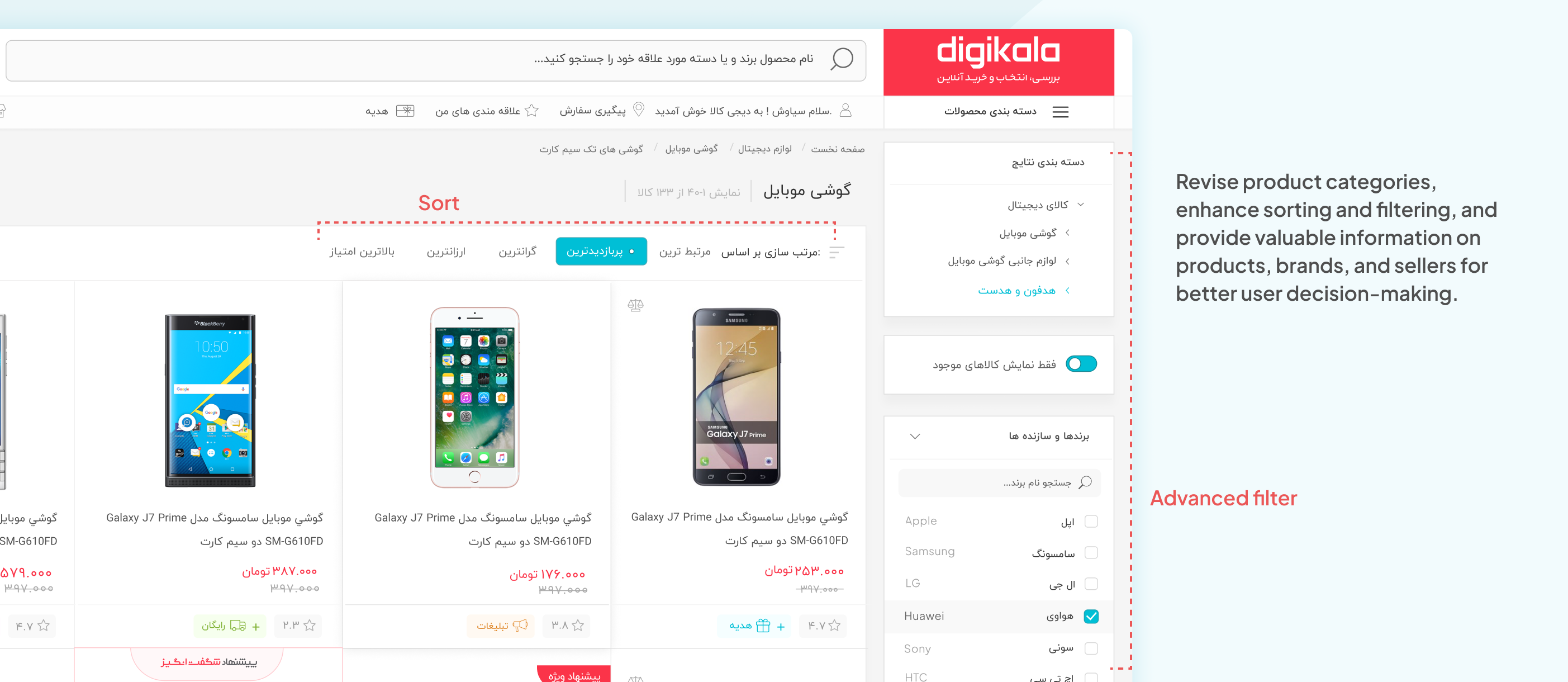
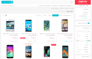
Redesign Product List: We have taken steps to enhance the user experience by redesigning the product list, filters, and sorting options. These enhancements enable users to navigate and find specific products more effectively, providing a seamless and efficient shopping experience.
Trust and Safety:
To maintain Digikala as a trusted brand and ensure user satisfaction after the transition to the marketplace, we propose several design solutions:
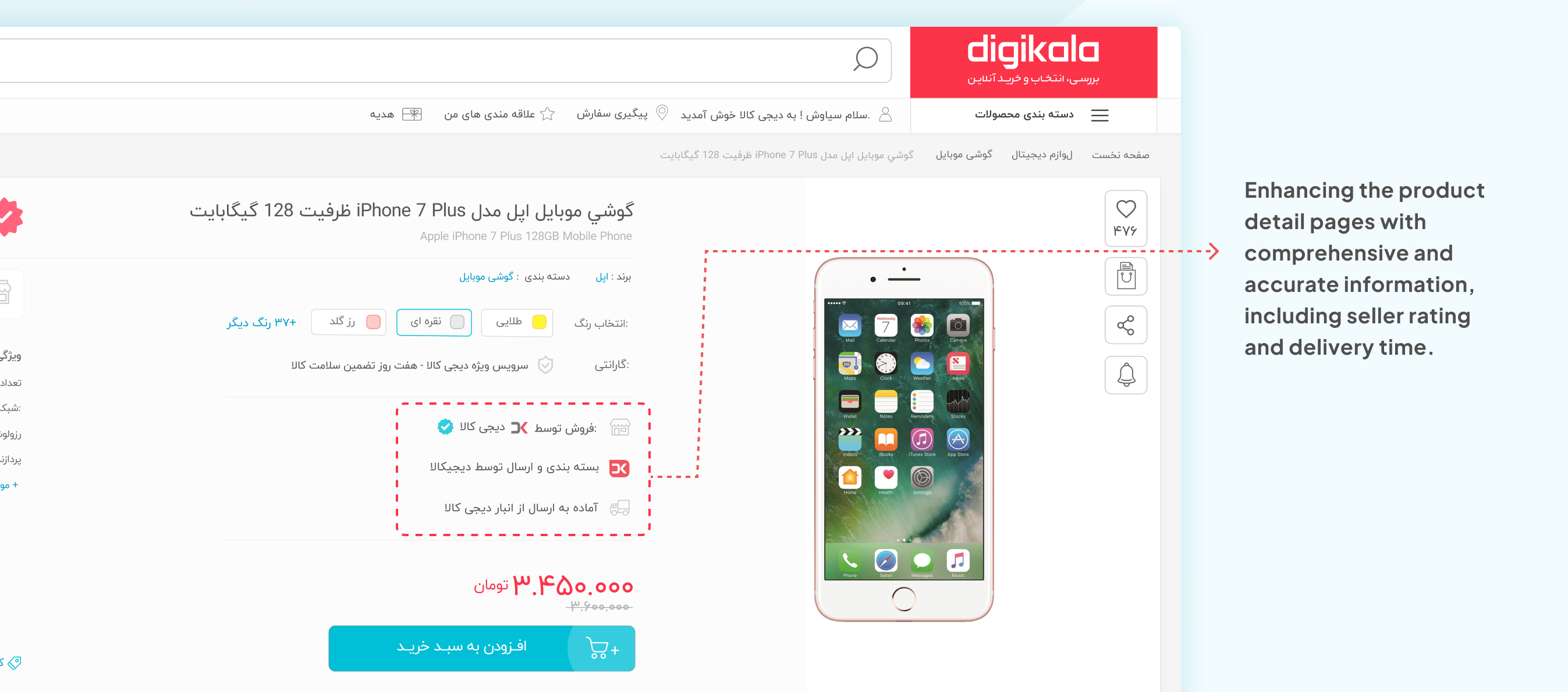
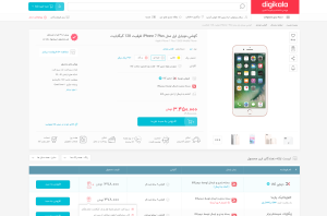
Clear and Transparent Product Information: Enhancing the product detail pages with comprehensive and accurate information. This includes clear descriptions, specifications, seller name and rate, and customer reviews to provide users with a complete understanding of the products they are interested in.
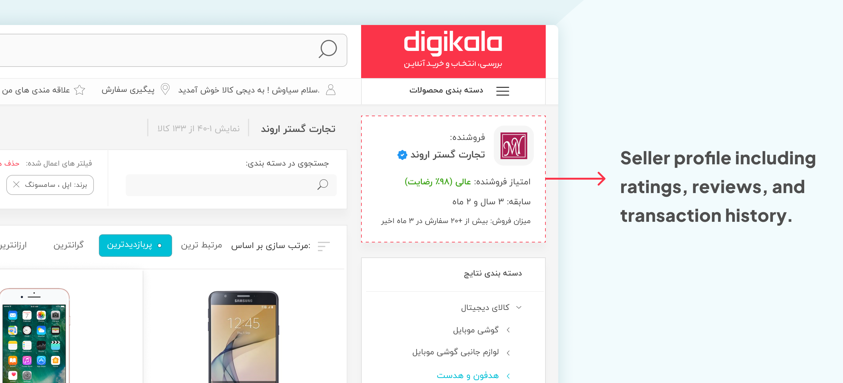
Create Seller Profiles: Enhancing seller profiles to include relevant information such as ratings, reviews, and transaction history. This allows users to make informed decisions when choosing sellers, fostering trust and confidence in their purchasing decisions.
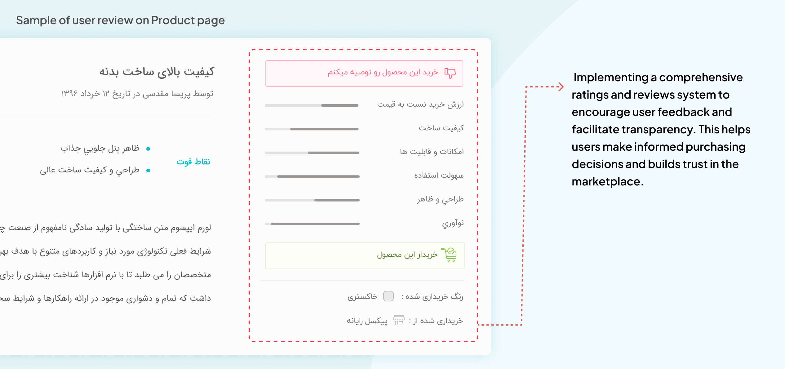
Ratings and Reviews System: Implementing a comprehensive ratings and reviews system to encourage user feedback and facilitate transparency. This helps users make informed purchasing decisions and builds trust in the marketplace.
Multi-Seller Shipping
We redesigned Digikala’s shipping and checkout process to account for the different delivery times from multiple sellers. This update ensures that users are informed about these variations, empowering them to make informed decisions while shopping.
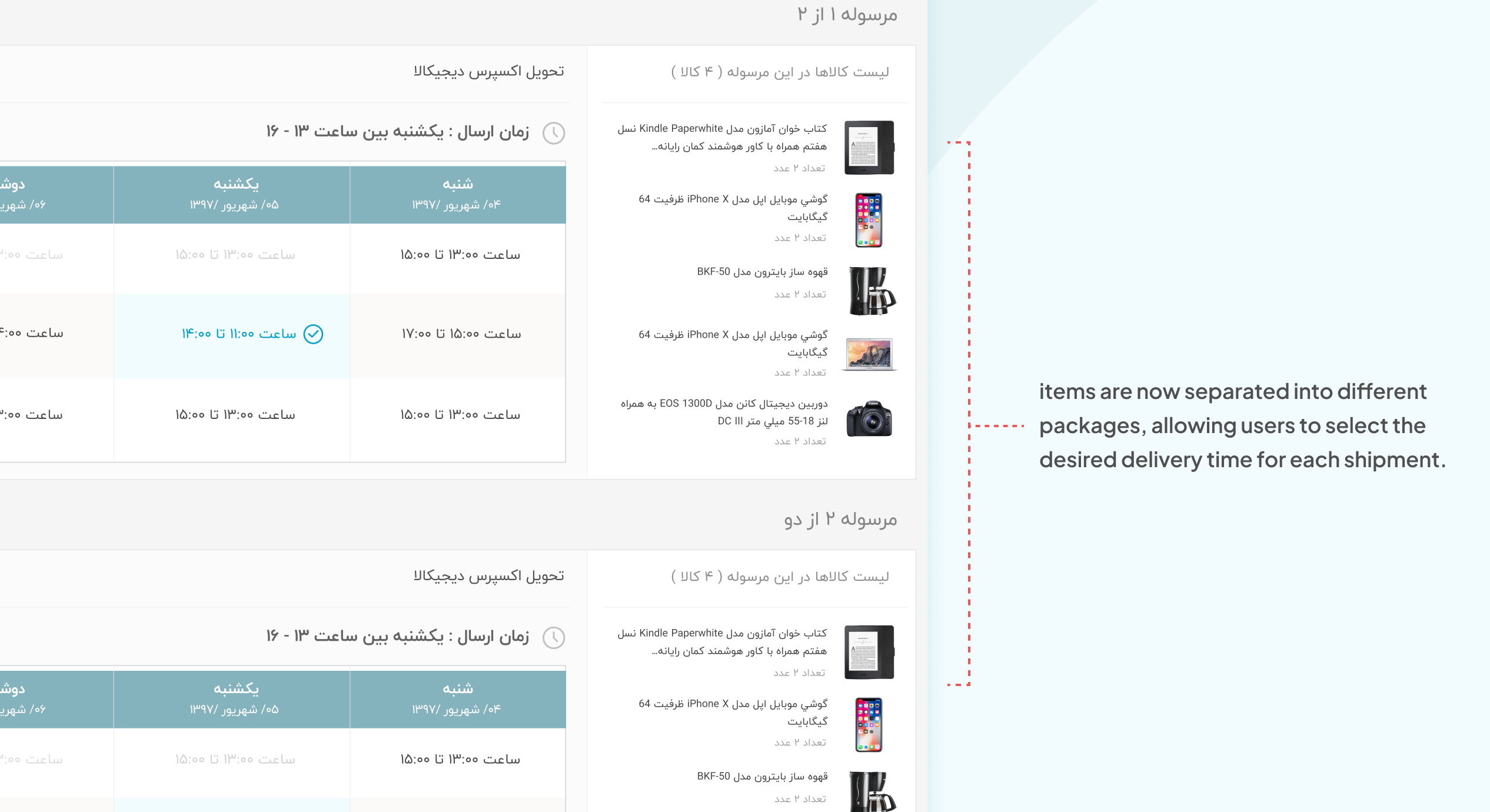
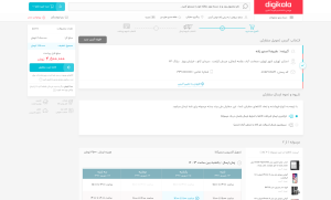
On the shipping page, items are now separated into different packages, allowing users to select the desired delivery time for each shipment.
Conclusion
Our data and testing demonstrate that the past redesign of Digikala into a marketplace significantly improved the user experience. The broader range of products, easier product discovery, increased trust and safety measures, improved navigation and filtering, and more detailed seller information all contributed to higher user satisfaction and engagement.
Final Designs:


